Slow and hard to use
The existing app was the most common complaint, from every survey participant.
New: Chai, my AI assistant, can brief you on my work in 60 seconds.
Case study · MTN Nigeria · Telecom · 2023–26
An end-to-end redesign of MTN Nigeria’s app, built around how people recharge, buy data, manage family numbers and find something to watch.
At a glance
The challenge
MTN Nigeria wanted to grow new users from 1.2 million to 20 million while Airtel, 9mobile and Glo took market share. Young Nigerians, the customers MTN most wanted, were unhappy with the app, and every survey participant called it slow and hard to use.
What I led
The outcome
Recharge, buy data, manage family numbers and find something to watch, in one simple app.
Context
MTN subscribers, December 2020
MTN’s market share in Nigeria
Target for new users
MTN is a South African multinational and the eighth-largest mobile network operator in the world. It operates in more than 20 countries, and about a third of its revenue comes from Nigeria. MTN Nigeria started a digital transformation to improve its digital products, beginning with the mobile app and website.
The problem
Airtel, 9mobile and Glo were competing for the same customers. Young Nigerians, a key group of prospective customers, were dissatisfied with the whole app and online experience. Every participant in our survey said the existing app was slow and difficult to use.
The existing app was the most common complaint, from every survey participant.
Plans and offers were hard to understand, so people searched Google to find the best one.
Many users manage numbers for parents, partners and children, with no easy way to do it in the app.
Airtel, 9mobile and Glo were taking market share.
Business goal
Grow new user acquisition from 1.2 million to 20 million by giving people the most competitive digital experience in the market.

My role
Desk research, a user survey, competitor analysis and the persona.
User flows for login, recharge, bundles, help and profile, then wireframes.
High-fidelity UI and prototypes for the app and website.
Interaction design and motion across key flows.
Tested the low-fidelity prototype with users (partial involvement).
UX governance and validation of the final experience.
What I owned. As Senior UX/UI Designer at Tech Mahindra, I owned the UX definition and the design itself: the research and its synthesis, the persona, the user flows, wireframes, UI and prototypes, and the motion and interaction work. I also led UX governance, checking the build against the design.
Who I worked with. I worked inside a cross-functional product team for MTN Nigeria. Usability testing was a shared effort, and my part in it was partial.
Process
01 · Discover
I wanted to know which UX problems MTN users ran into on the app and website. I started with desk research on Nigerian digital adoption, internet use, competitor app feedback, habits and privacy, using data from Statista and DataReportal.
Questions the research had to answer
What are current purchase trends in Nigeria?
What do people buy most from telcos: prepaid or postpaid?
Which payment methods are used most?
Who leads Nigerian e-commerce, and why?
What is the best NPS among Nigerian telcos?
What is the age and gender of people who buy online?
Which lifestyle apps are used most in Nigeria?
What words do people use for data bundles, recharge and value-added subscriptions such as BBC Minute and Ayoba?
Survey results
A survey asked which MTN products and features people use today, to find gaps and new features worth building.
said the existing MTN app was slow and difficult to use
recharge their phone through digital channels
liked and took part in MTN’s short video contests
browse less because internet plans are expensive
search Google to find the best plan to buy
manage accounts for family members such as parents, partners and children
Competitive analysis
I reviewed app store feedback for Glo Cafe, My Airtel and 9mobile, MTNOnline.com keyword rankings, operator market share and DataReportal’s Nigeria data to find each competitor’s strengths and weaknesses. This shaped MTN’s feature set and information structure.
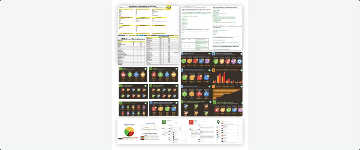
Keyword rankings, DataReportal statistics and competitor app-store reviews.
02 · Define
I synthesised the interview responses into themes, opportunities and features MTN could improve on. The persona sums up the key tasks, priorities and pain points.

25 · Lagos, Nigeria · Digital marketer · Existing MTN user
“App needs be improved, sometimes I have to wait for hours to receive OTP.”
Goals
Frustrations
Insights
Put together, the survey, the competitor review and Dora’s goals and frustrations gave four clear problems to design for.
Every survey participant called the app slow and hard to use, and Dora waits for OTPs and finds her phone slow.
9 of 16 people search Google for the best plan, and 11 of 16 browse less because plans are expensive.
58% manage accounts for parents, partners and children, and Dora wants to recharge numbers she hasn’t saved.
14 of 16 people took part in MTN’s short video contests, and Dora wants streaming apps.
Design principles
03 · Ideate
Quick sketches helped decide which elements each screen needed. I then mapped the main user flows and built a low-fidelity prototype for the first round of user testing.
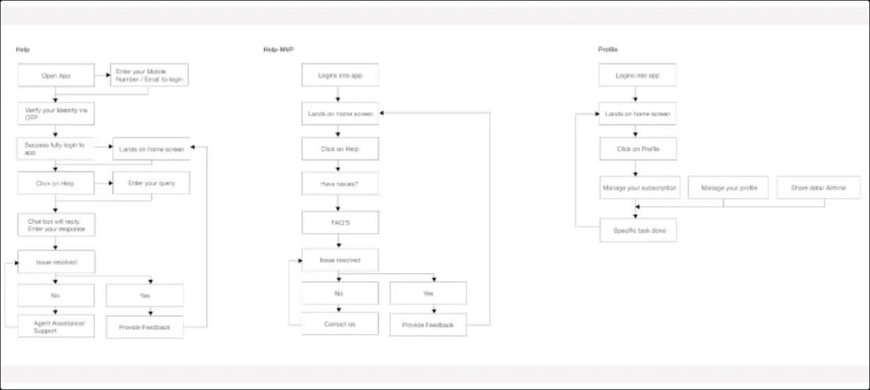
User flows for Help, Help MVP and Profile. Help starts with a chatbot and hands over to an agent if the issue is not resolved.
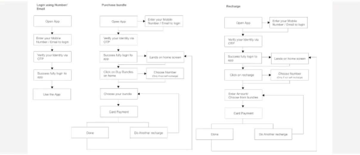
User flows for Login, Purchase bundle and Recharge. Both purchase flows end with the option to do another recharge.
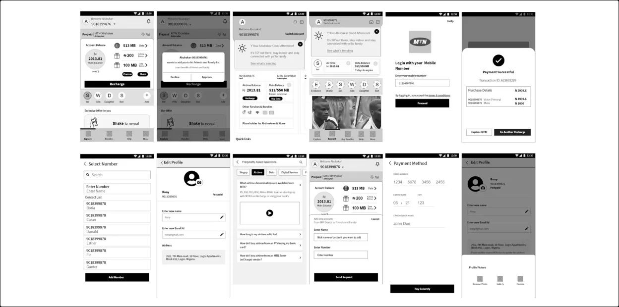
Low-fidelity wireframes used for the first round of testing.
Key decisions
58% of people manage accounts for family members. The home screen lets users switch between their own number and family numbers, and add new ones.
Expensive plans and confusing offers sent people to Google. The app recommends plans based on how each person uses data, such as a plan for someone who spends most of their data on Netflix.
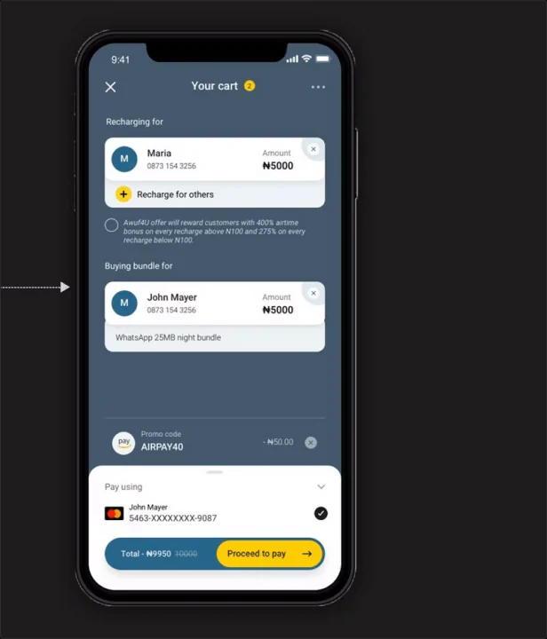
15 of 16 people recharge digitally, and Dora wants to top up numbers she hasn’t saved. Recharge works for yourself, saved family numbers or any number, with recent recharges one tap away.
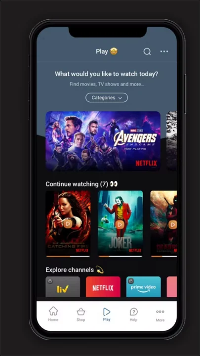
14 of 16 people enjoyed MTN’s short video contests, and Dora wants streaming apps. A Play tab brings OTT platforms into the app, and non-MTN users can sign in to watch.
Every survey participant called the old app slow and hard to use. The UI keeps screens uncluttered, with quick links for the most common tasks.
04 · Design
The visual direction drew on bright, friendly Nigerian colour while keeping each screen minimal and functional, because users asked for a clutter-free, curated experience.
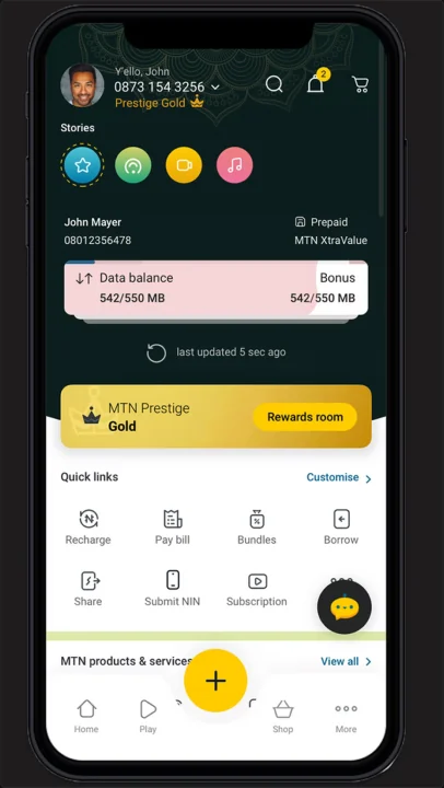
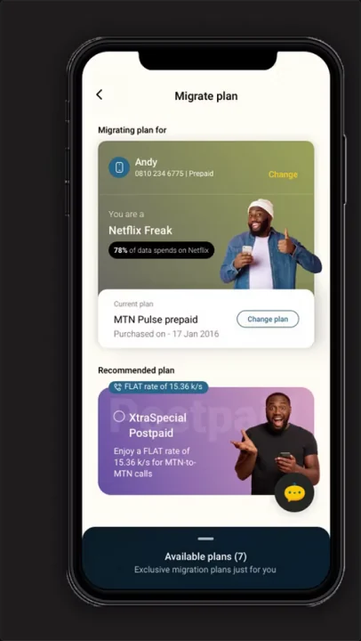
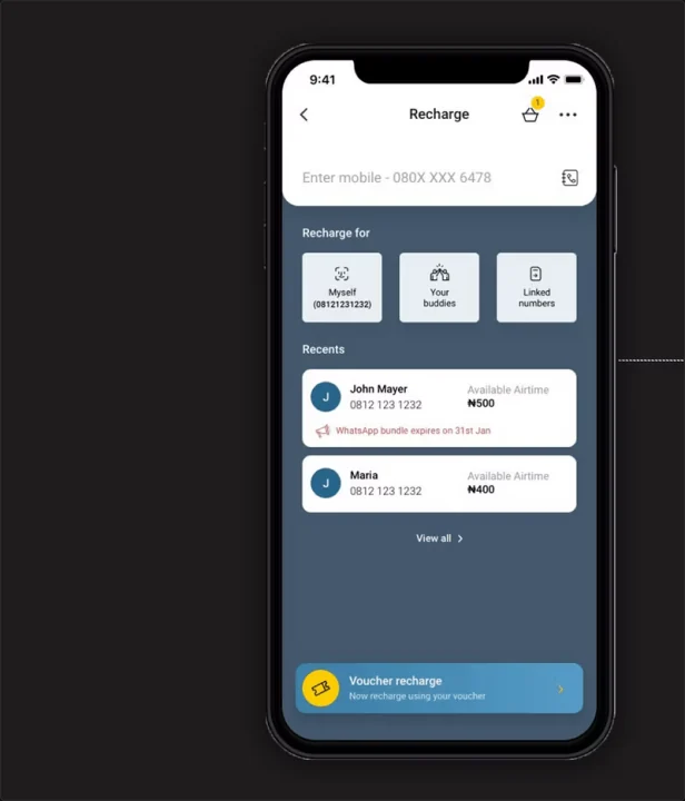
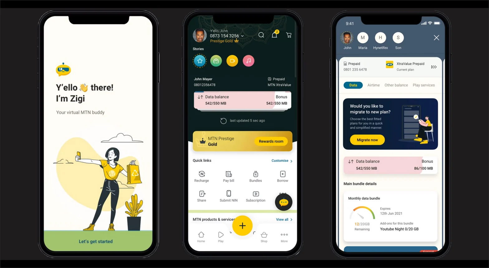
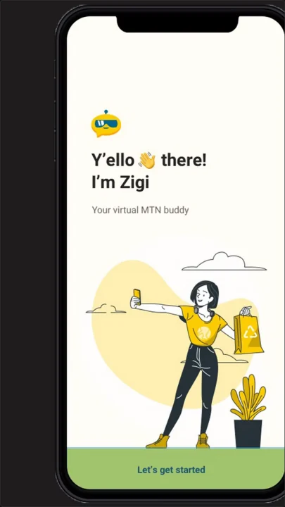
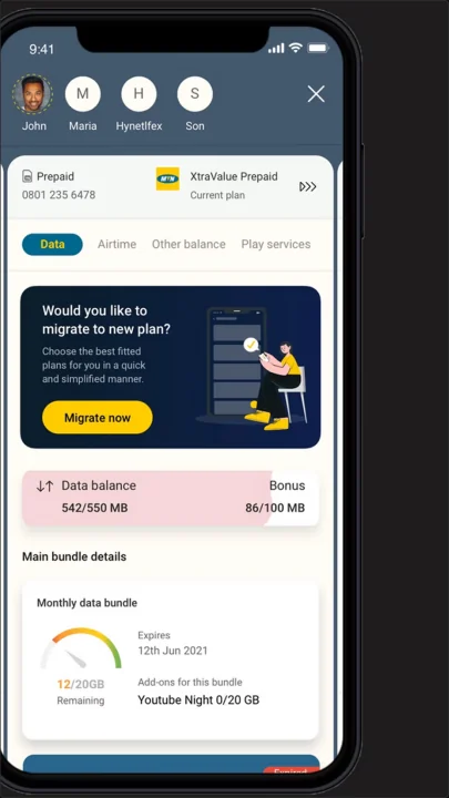
Zigi, a virtual MTN buddy, welcomes new users. The home screen shows data and bonus balances, Prestige rewards, stories, and quick links for Recharge, Pay bill, Bundles, Borrow, Share, Submit NIN and Subscription.
Users can switch between their own number and family numbers from the top of the screen.
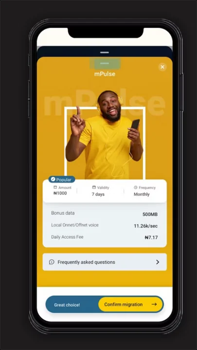
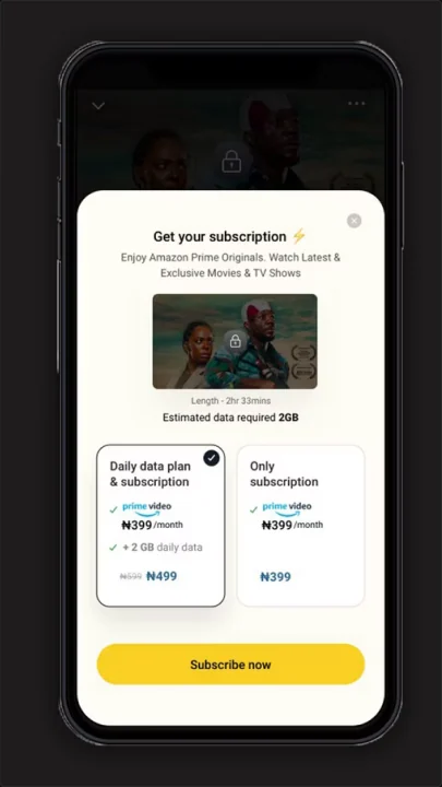
Only plans that fit a person’s usage are shown. A user who spends most of their data on Netflix is offered a matching plan, and streaming subscriptions can be bundled with daily data.
Recharge for yourself, your saved numbers or any number, with recent recharges listed and voucher recharge at the bottom.
The Play tab brings Netflix, Prime Video and other platforms into the app, so people can find content without leaving it. Non-MTN users can sign in to watch too.
Beyond the core
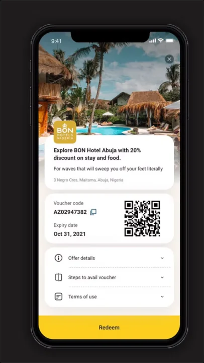
Loyal customers get rewards such as a 20% discount voucher for BON Hotel Abuja, redeemed with a QR code, and BBC content such as Football Daily and The Comb plays inside the app.
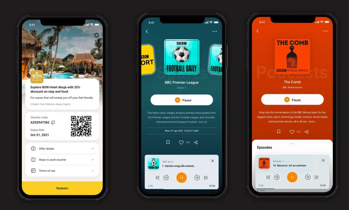
Rewards and BBC audio content for loyal customers.
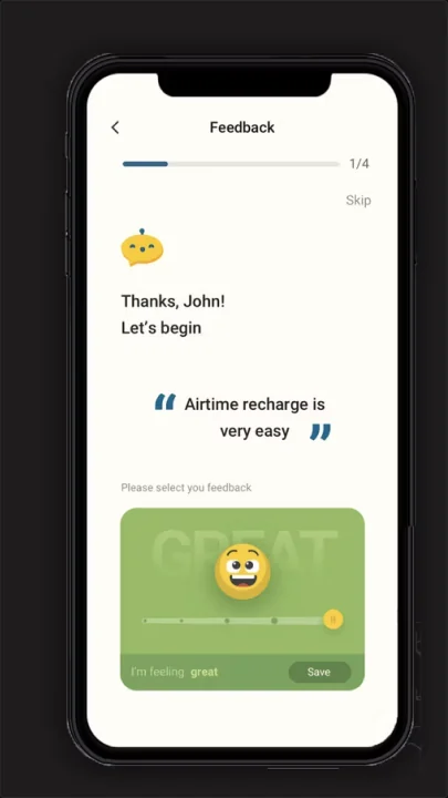
Feedback takes four short steps with an emoji slider, and ends by inviting users to share MTN with friends and family to earn vouchers.
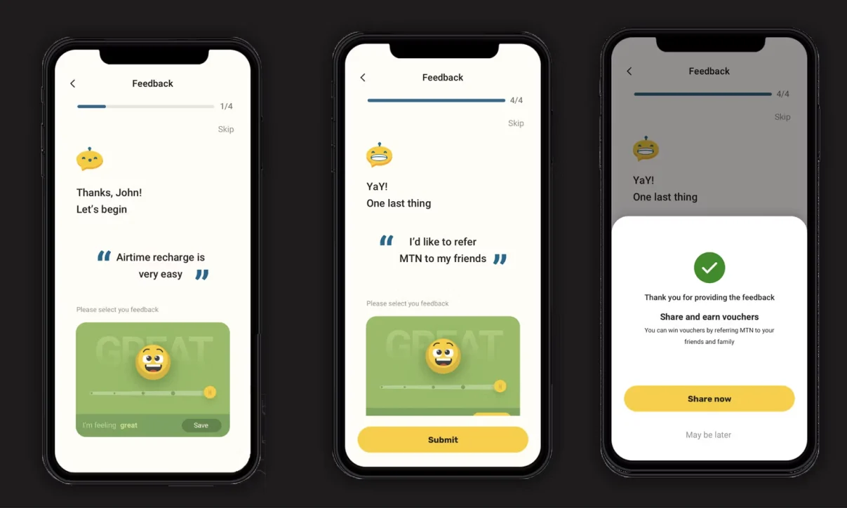
The in-app feedback flow, from first question to the share prompt.
All screens
Validate
The low-fidelity prototype went to users for the first round of testing, and I was part of the usability testing that followed. I also led UX governance, checking the final experience against the design.
First round of user testing on the main flows.
Testing that followed, with my partial involvement.
The final experience checked against the design.
Outcomes
Learnings
How people name data bundles, recharge and subscriptions was one of the first research questions, because labels decide whether people find a feature.
Many users look after numbers for their family, so the account model had to handle more than one person.
When plans feel expensive, people browse less. Recommending the right plan matters as much as the plan screen itself.