Late scores, hard menus, fantasy elsewhere.
Scores lagged during tense moments, a menu-heavy structure hid team pages and stats, fantasy sat in a separate section, and the app had little to offer between matches. Many fans were on budget phones.
New: Chai, my AI assistant, can brief you on my work in 60 seconds.
Case study · Tata IPL · Sports · Web & mobile
A mobile-first redesign of the Indian Premier League’s website and app, built for fans following live matches.
At a glance
Scores lagged during tense moments, a menu-heavy structure hid team pages and stats, fantasy sat in a separate section, and the app had little to offer between matches. Many fans were on budget phones.
As Senior UX/UI Designer for BCCI, via Tech Mahindra, I ran the research, rebuilt the information architecture and user flows, set the style guide, designed the web and mobile UI, A/B tested key screens and handed over to developers. I worked with BCCI and with the UX, design and development teams.
App ratings went up on both stores. Fantasy now lives inside match cards and player profiles, and non-match days have their own content.
Impact
Higher engagement, and more fans arriving on mobile.
user engagement
mobile traffic
app ratings on both stores
Context
The IPL, launched in 2008, draws fans with very different levels of cricket knowledge, from people who track every ball to casual viewers. Match situations change fast, so the app has to keep up in real time while also carrying highlights and other video.
The redesign covered the IPL website and the iOS and Android apps, for BCCI via Tech Mahindra. It was mobile first, built for fans following live matches, with the website following the same structure.
The problem
The old app felt overwhelming during matches and had little to offer on days without one.
Fans expect updates the moment something happens. Delays pushed them to other apps.
A menu-heavy structure made team pages, fixtures and player stats hard to find.
Fantasy sat in a separate section, away from the match and player data it depends on.
With little content between matches, daily active users dropped sharply.
Redesign goalA fast, fan-first app: real-time match updates, simpler navigation and fantasy built in.
Business goalIncrease engagement and retention, and drive traffic on both match days and non-match days.
User goalFast scores, easy access to match content, and a fantasy experience that works inside the app.
My role
I took the redesign from research and wireframes through to developer handover. I worked with BCCI on requirements and with the UX, design and development teams to get the design built.
Ran requirement gathering, user interviews, app store review analysis and session analytics.
Rebuilt the information architecture and user flows around the most frequent fan tasks.
Turned research insights into six engagement features for match and non-match days.
Wireframes, style guide and UI for web and mobile, in line with IPL branding.
A/B tested key screens and used the results to refine them.
Adaptive designs for different screen sizes and budget devices, and handover to developers.
Process
01 · Empathise
Discovery started with the existing app, user feedback and analytics. We interviewed fans, read through app store reviews, analysed session data across previous IPL seasons, studied trends in sports app engagement and spoke with stakeholders. The same themes kept coming up: late scores, cluttered layouts and features that were hard to move between.
Fans across the range, from die-hard followers to casual viewers.
Complaints and requests in existing ratings.
Behaviour across previous IPL seasons, match days and off days.
Cricbuzz, ESPNcricinfo and the ICC app.
Key findings
Even a 2 to 3 second lag in scores during tense moments led to frustration and fans switching apps.
Fans struggled to reach team pages, upcoming matches and player stats quickly, which led to high drop-off.
Fantasy players wanted player performance, stats and suggestions without jumping between apps or screens.
On non-match days the app had little content, and daily active users declined steeply.
A large share of users were on budget devices. Heavy UI and media caused slow loads and occasional crashes.
Fans liked short content and game-like interactions, and wanted personalisation and a fan identity inside the app.
Users
Track live scores, player stats and team updates throughout the match, and want real-time data with strong visuals.
Most active during match hours. Need quick access to player form and live updates to make team decisions.
Want a simple interface with quick highlights, key moments and the essential match information.
Watch interviews, behind-the-scenes video and expert commentary, including on non-match days.
Often on budget phones and slow networks. Need a light app, fast loading and local languages.
Benchmark
None of the competitors offered fantasy inside the app, which made it the clearest gap to close. On scores, navigation and performance, the old IPL app trailed all three.
| Experience | IPL before | Cricbuzz | ESPNcricinfo | ICC app | IPL after |
|---|---|---|---|---|---|
| Live score speed | ✕Delayed | ✓Real-time | ✓Real-time | ✓Real-time | ✓Real-time |
| Navigation | ✕Complex | ✓Intuitive | !Slightly cluttered | ✓Simple | ✓Simplified |
| Fantasy | ✕Disconnected | ✕Not available | ✕Not available | ✕Not available | ✓Built in |
| Visual design | !Outdated | ✓Modern | ✓Clean | ✓Minimal | ✓Rich visuals |
| Video & highlights | !Limited | ✓Rich content | ✓Comprehensive | ✓Available | ✓Prominent |
| Budget devices | ✕Laggy | ✓Optimised | !Medium load | ✓Smooth | ✓Light |
| Personalisation | ✕None | ✓Basic | !Limited | ✕None | ✓Recommendations |
| Notifications | !Limited | ✓Strong alerts | ✓Custom alerts | !Limited | ✓Improved |
Ratings are my assessment at the time of the redesign.
02 · Define
Fans mostly check live scores, manage fantasy teams, watch highlights and browse stats. The new information architecture puts those first, organises video and news by type and recency, and gives fans something to open on non-match days.
What the findings asked for
Old vs new structure
| Before | After |
|---|---|
| Home: a cluttered mix of features | Home: a personalised feed with the live match, news and fantasy |
| Match Center | Matches: Live, Upcoming and Results tabs |
| Teams | Teams & Players |
| Stats, buried in the menu | Stats, with filters for players, teams and formats |
| Fantasy, a separate section | Fantasy, built into match cards and player profiles |
| Videos, hard to find | Media hub: highlights, interviews, behind the scenes, trending |
| News, a basic list | Newsroom: categorised, with match-related news |
| Menu-heavy navigation | Bottom navigation, contextual actions and search |
Bottom navigation
Contextual tabs inside each section (Live, Upcoming and Results under Matches), search, and deep links let fans jump straight to a player, team or match from inside or outside the app. The new structure reduced cognitive load and shortened the time it takes to reach content.
Key decisions
The menu-heavy structure caused drop-off. Home, Matches, Fantasy, Media and More keep the main tasks one tap away.
A 2 to 3 second delay was enough to send fans elsewhere, so a live score bar sits just above the bottom navigation.
Fantasy players did not want to switch screens. Player form and stats now sit where they make their picks.
Fans asked for personalisation and a fan identity. Choosing a favourite team and player sets up the home feed and alerts.
Many fans use budget phones, so screens were designed to load fast and adapt to different devices.
03 · Design
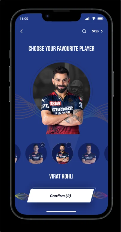
Onboarding asks fans to choose a favourite team and player, which sets up the home feed. A style guide kept the bold IPL branding consistent across mobile and web.
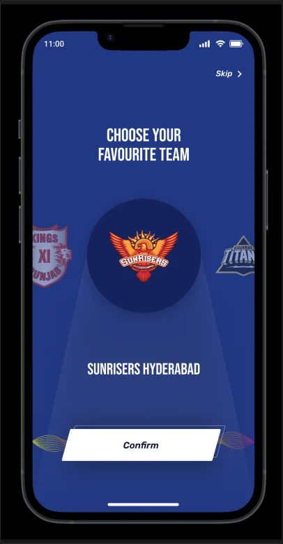
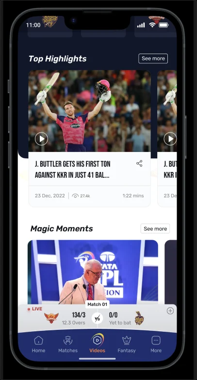
Fans asked for personalisation and a fan identity. Onboarding starts with a favourite team, which sets up the home feed.
Choosing a favourite team and player sets up the home feed and alerts.
The home feed with top highlights, magic moments and the live score bar above the navigation.
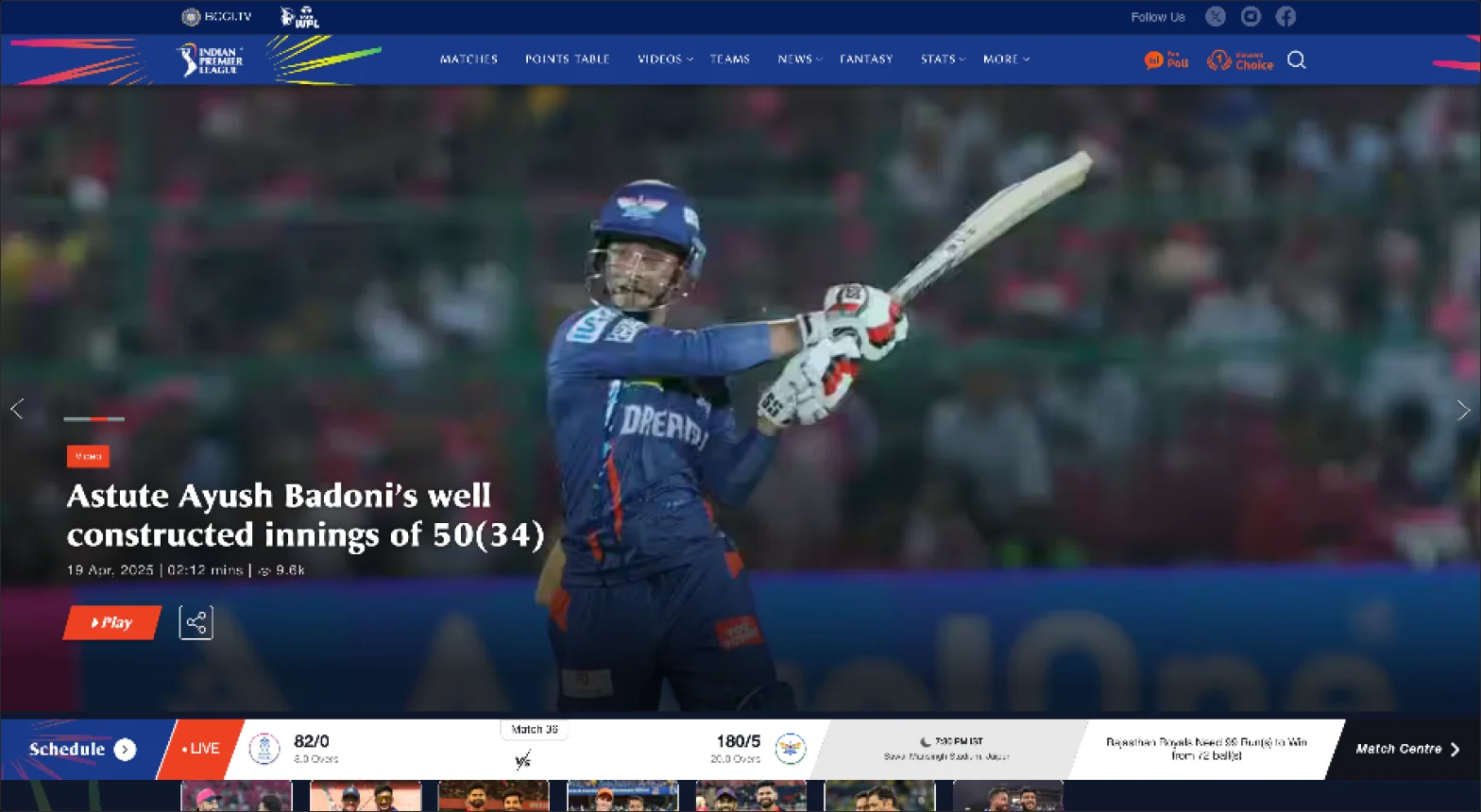
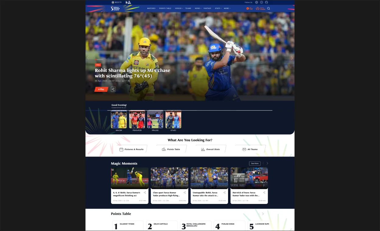
Website home: a featured story with video, and navigation for Matches, Points Table, Videos, Teams, News, Fantasy and Stats.
03 · Design: engagement
Interviews and behaviour across previous IPL seasons showed that scores alone would not keep fans coming back. These features answer the research insights on team loyalty, short content, game-like interactions and fan identity.
Pre-match countdowns, team trivia and lineup predictions, with animation that matches the IPL brand.
Daily prediction contests, fantasy mini-leagues, rewards, and badges such as “Super Selector” and “Match Predictor” to bring fans back.
Tap any player for stats, performance heatmaps and fan polls, and follow them for alerts.
Exclusive videos, player stories and locker-room moments, aimed at non-match days.
A home feed shaped by favourite teams, players and recent activity, with alerts for match start, milestones, fantasy tips and player updates.
A moderated space for reactions, memes and match commentary, linked to Instagram Stories and YouTube Shorts.
04 · Deliver
Key screens were A/B tested. Final designs were adapted for different screen sizes and lighter devices, and handed over to developers.
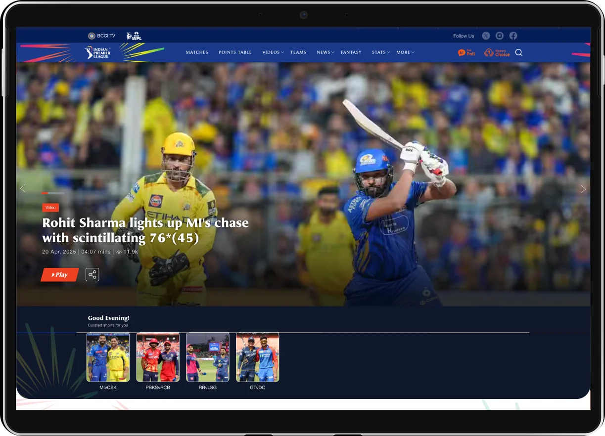
The website home adapted for tablet.
Outcomes
user engagement
mobile traffic
app ratings on both stores
Learnings
A 2 to 3 second delay was enough to lose a fan to another app, so the live score bar sits above the navigation.
Engagement fell between matches, so non-match days needed their own content and features.
Many fans were on budget devices, so keeping screens light became part of the design brief.